MyMTA app
Designing A Better NYC travel Experience
MTA is the largest transportation network, serving 15.3 million people in New York City. It strives to be cost-efficient, safe, on-time, reliable, and a clean transportation services. The myMTA app was launched in 2018 to better serve riders.
I was part of a team that took on the ambitious task to redesign the NYC transit travel app, myMTA.
Below is the design process followed and the evaluation of the current 2019 App
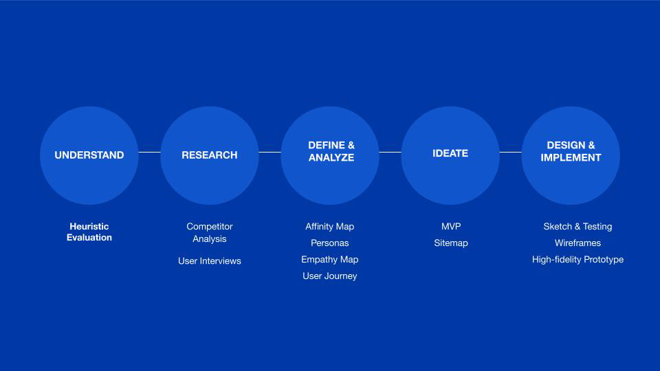
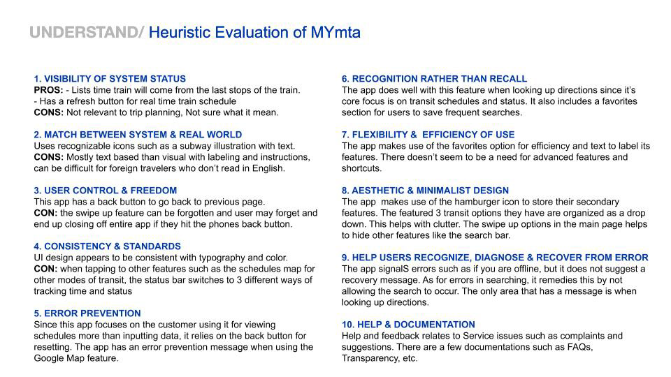
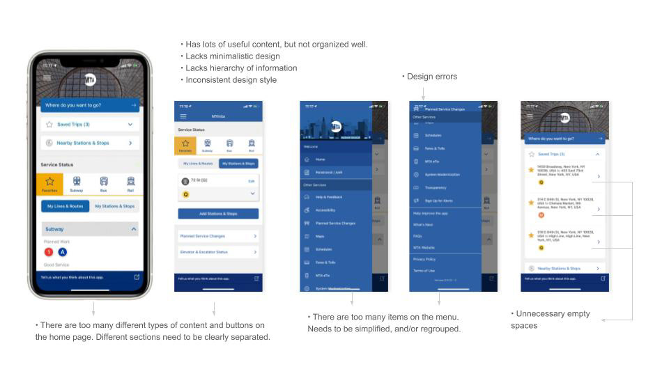
An analysis of the current app
Most NYC transit riders agree that despite fare hikes, the cost of NYC public transit is still affordable, but it is not as reliable, on-time, clean or safe. on July 2018, the MTA launched the myMTA app and has listened to user feedback to develop its features.
Despite valuable feedback, customers still felt the interface and was lacking, enough to delete the app entirely.
Below is an evaluation of the myMTA app.
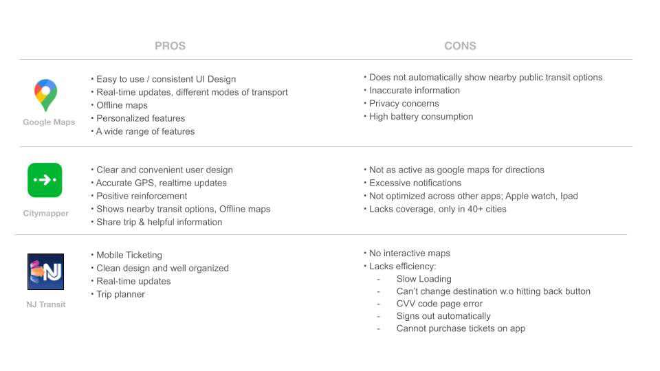
analysis of competitors
The biggest competitors of the myMTA app are Google Maps, Citymapper and NJ Transit. We researched the pros and cons of of these apps to figure out what customers felt was appealing to them and what features we should include to make the new and improved myMTA redesign user friendly.
Below is the breakdown:
interviews:
native nyc transit rider
There are many types of NYC transit riders. My team pinpointed 3 types of riders: The Native NYC Transit Rider, The Outer Borough Commuter and The Tourist/ Visitor.
I interviewed Native NYC Transit Riders that range from age 18- 65. For such a large generation gap, they all had surprisingly similar needs.
People that have used the MTA transit system for years don’t exhibit much anxiety about getting lost or finding their way because they are experts on using the train/ bus/ subway.
Native NYC transit riders have creative ways to problem solve common issues such as signal malfunctions, getting off the wrong stop, leaving at a less convenient exit and bad smells.
Most native NYC transit riders interviewed don’t use an app, but if they need directions, they use Google Maps or Citymapper. The few that have used the myMTA app reports using it just for transit status. They think the design is confusing.
Below is the Affinity Map for myMTA.
Link to Affinity Map
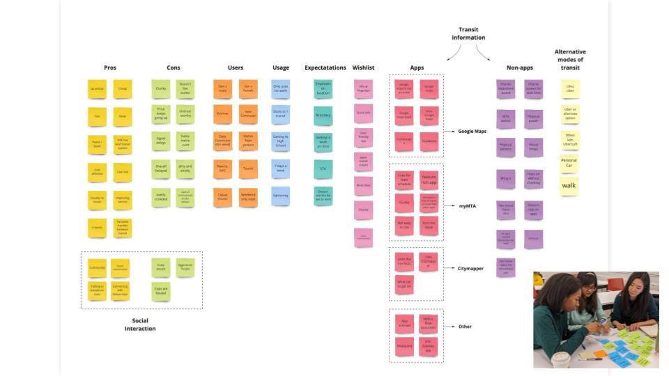
Affinity Map
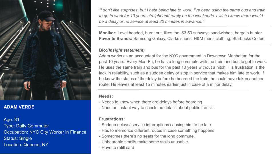
User Persona
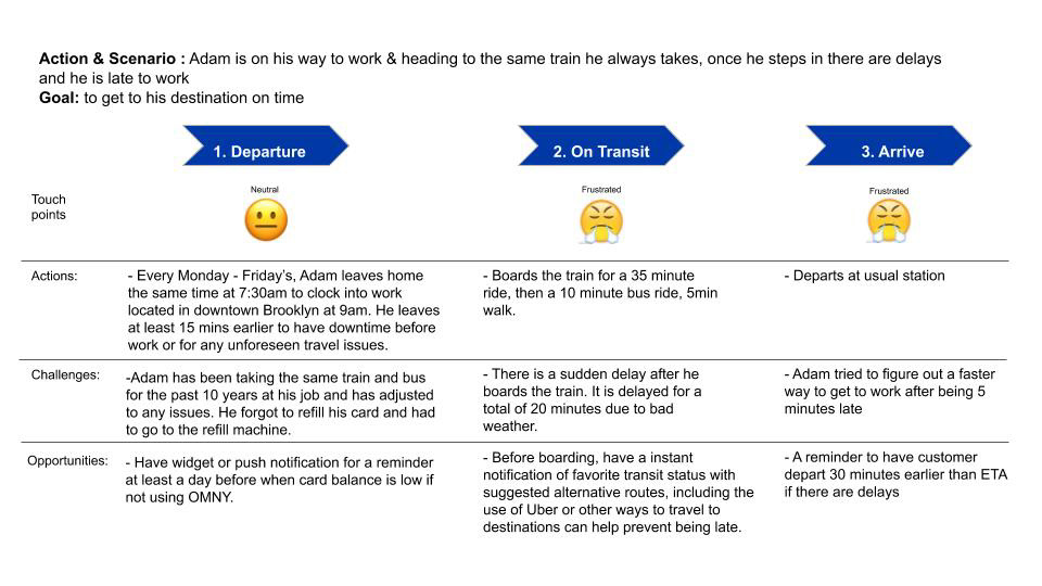
Adam's Journey
The Goal:
Create notifications
From the user persona, it was deduced that Native NYC transit riders valued foresight when planning their route. They also appreciate knowing that their metro card balance is running low before heading to the train or bus and they also don't like fumbling for information on their phone while rushing for the train or bus.
Our high level goal is to:
1. Give customers a peace of mind that there favorite mode of transportation is running well before departure, or suggest a solution if not
2. Prevent frustration from a low metro card balance
3. A quick and easy to customize reminder
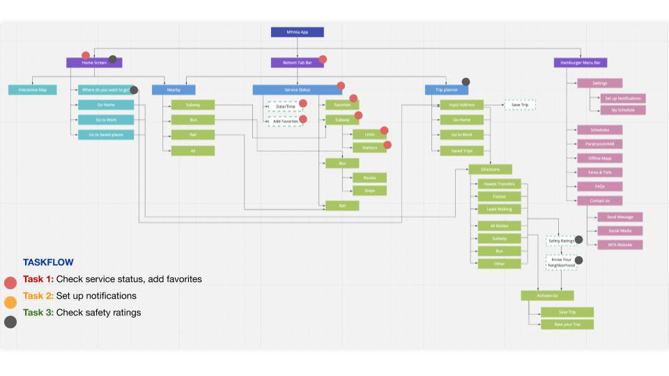
app redesign, Sitemap and taskflow:
Native NYC riders are on the go and don't have time to fiddle with an app, but they want to be able to know if the bus or train they always use will have a delay. The best course of action is prevention.
The solution I came up with is a push notification. To set up the notification, you can easily pull it up from the hamburger menu in settings. From there, it is easy to customize what transit system you want information on and the days and times you want to be reminded.
To prevent users from running to the bus instead of a metro card kiosk for a refill, customers can now scan their card or enter the unique number to view metro card balance. This feature can also be toggled on or off.
See full sitemap
Prototype 1:
building the app
The sketches below illustrate the layout of the redesign app.
During testing, users helped to identify confusing features such as names chosen for the toolbar, placement of notifications and its organization.
During testing, users helped to identify confusing features such as names chosen for the toolbar, placement of notifications and its organization.
Testing Prompt: "Where would you go to set up a notification for your favorite station and metro card balance?
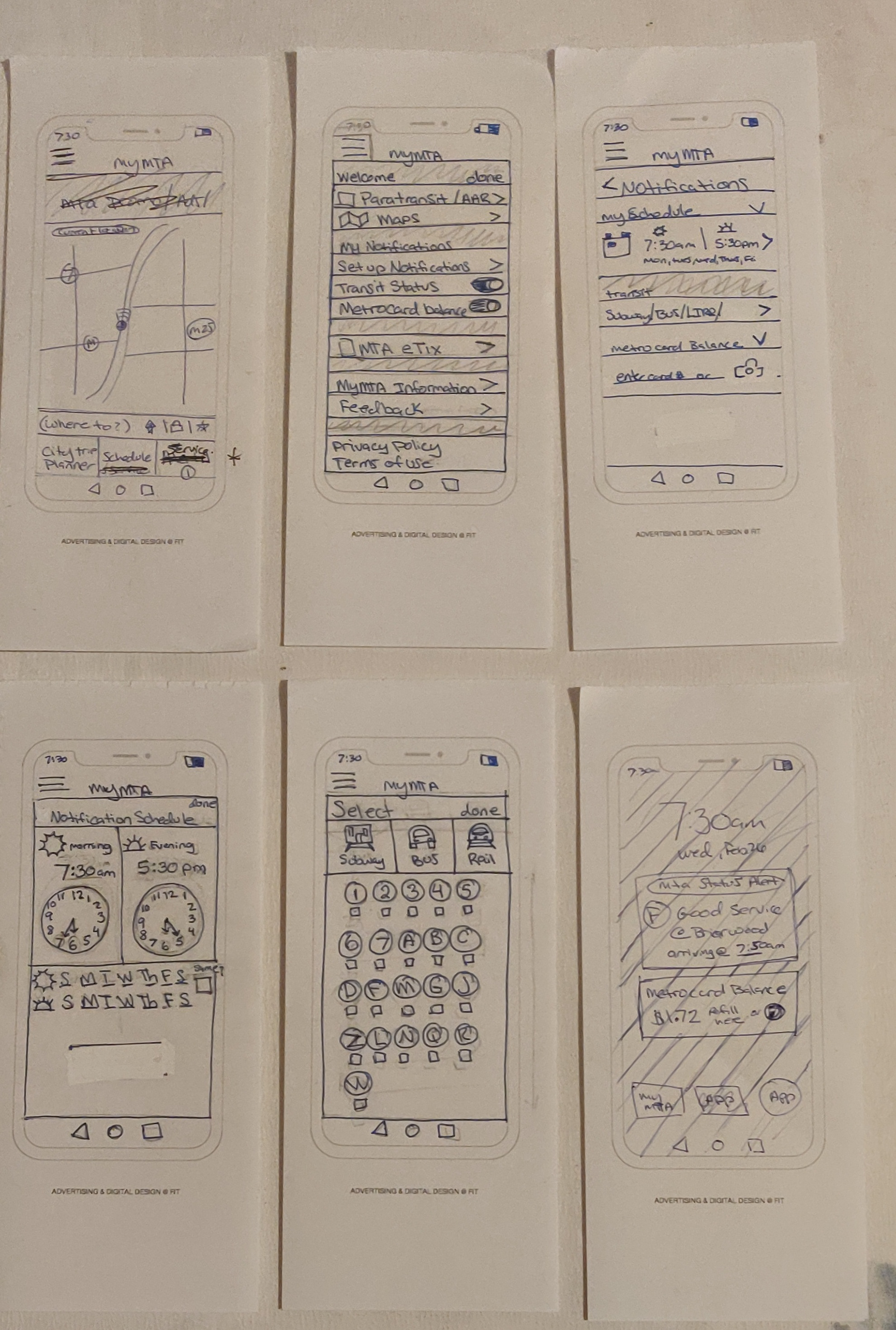
Sketch of Low Fidelity Prototype
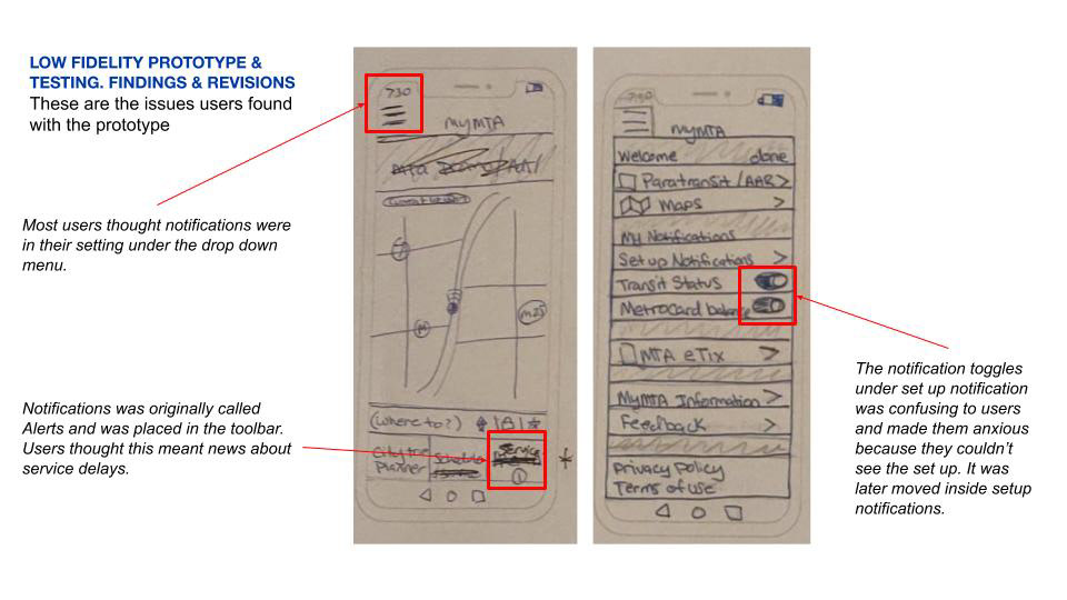
Prototype 1: Issues and revisions
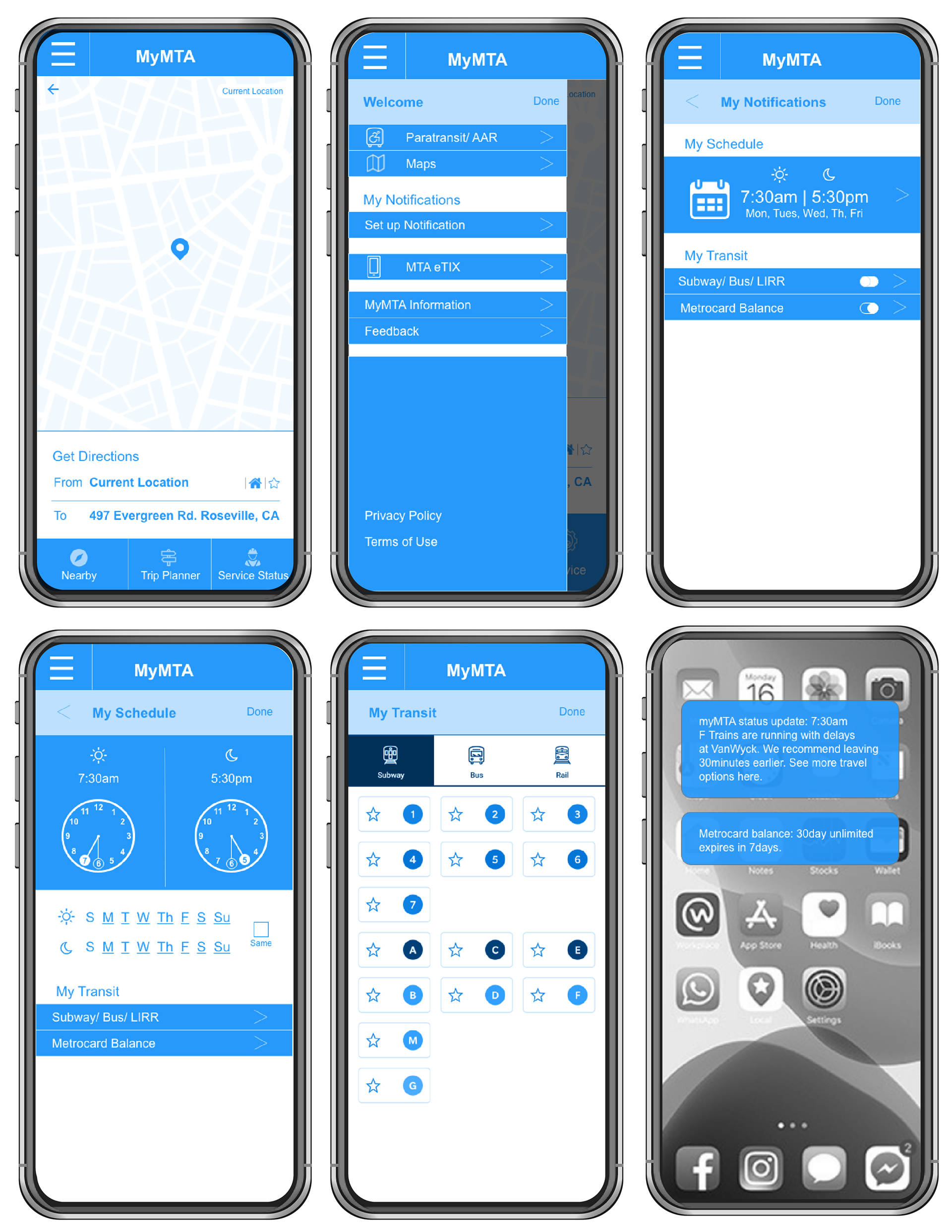
Mid fidelity wireframe
People are most comfortable and secure when they can see where they are and something familiar. Thus, the final design opens with a recognizable map, similar to Google Maps, with the addition of viewing a street view with nearby transit.
Simplifying the toolbar on the bottom reduces confusion and tidies up the interface for easy access. the pull out menu was also simplified as to de clutter and only have items customers would use. Miscellaneous news is truncated in a drop down menu under "myMTA information."
Notifications was set apart as an important tool for users. The notifications are easy to customize with a "delightful" clock to follow your favorite transit system at specific times of the day.
Video play through of app redesign
In this demo, the user sets up both the time and metro card balance set up.